Have you ever wondered what technical trading indicators to use in your forex trading? If you are, then this article will surely appeal to you. When you decide on your technical analysis trading strategy, you should carefully choose your trading weapons! And though my personal style of trading involves more pure price action analysis rather than the use of indicators themselves, I do believe that they can be very useful when applied correctly. Today we will go through some the top technical analysis indicators for Forex trading. We will discuss the signals we can get from these indicators and the way you can incorporate them into your own Forex trading approach.
Forex Technical Indicators
The technical analysis indicators, we will be discussing could be leading or lagging based on the time at which they provide a signal.
Leading indicators are also called Oscillators. These are the Forex technical indicators which give you an entry/exit signal before the actual occurrence of the respective event.
Lagging indicators are typically Trend-Confirming Indicators. Lagging indicators give confirmation signals after the actual occurrence of the event. These are the trading indicators, which would give you a confirmation signal that the trend on the chart is underway.
Let’s now go through the best technical indicators for Forex Trading:
Leading Indicators (Oscillators)
Leading indicators are the indicators, which manage to give you a preliminary signal. This means, that a leading indicator could put you in the market in advance of the potential move, Keep in mind that even though leading indicators can get you into a trade at the beginning of a new leg, many times you can and will get false signals along the way.
Therefore, traders often combine more than one leading indicators in order to eliminate as many fakeouts as possible. Let me now show you two of the most widely used leading technical indicators in Forex! These are the Stochastics indictor and the RSI indicator.
Stochastic Indicator
The Stochastics indictor was created by George Lane, and is one of the most popular indicators around. I, myself, had the pleasure of meeting George Lane back in the late 1990’s and spent about a week learning his trading methods. But that’s a story for another day. In essence, the stochastic indicator is used to determine overbought and oversold conditions in the market. In other words, the Stochastic can sometimes tell you that there is too much buying in the market and prices could be due for a correction. If the signal is oversold, then the Stochastic is telling you that maybe there are too many selloffs with this currency, and a possible rebound is due.
The Stochastics indicator consists of two lines which move together and interact with each other at some point. In addition the indicator has an upper and lower zone .The upper area is the overbought area and the lower area is the oversold area.
When the two lines enter the lower area, the Stochastic is giving us an oversold signal. In this case, we can buy the currency pair when the two lines cross upwards on their way out of the oversold area. If the two lines enter the upper area, the Stochastic is telling us that the Forex pair might be overbought. Then we can sell the pair when the two stochastic lines cross downwards on their way out of the overbought area. These are the two basic signals which the Stochastic Oscillator gives us.
However, the Stochastic is also very useful for divergence trading. If you do your technical analysis using the Stochastic, you will often notice that the indicator is moving upwards and the price is moving downwards, or the opposite. These are bullish and bearish divergences. If there is a bullish divergence between the price and the Stochastic, we can anticipate a possible price increase. The opposite is in force for bearish divergence. Now let’s take a closer look at the Stochastic Oscillator:
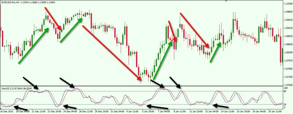
This is the H4 chart of the EUR/USD for the period Dec 16, 2015 – Jan 20, 2016. On the bottom of the chart you will see the Stochastic Oscillator.
- The first black arrow shows us the Stochastic in the oversold area. Stochastic breaks upwards and the price starts increasing.
- Then we have an overbought signal. A decrease comes right afterwards.
- A new oversold signal sets the beginning of a new bullish trend.
- The next overbought signal leads to the biggest decrease on this chart.
- On its way down the Stochastic gives us one false oversold signal.
- Then we get the real thing – an oversold signal which puts us in a big long position.
- The next signal is tiny and it hints for an overbought market. The price move is tiny too.
- Then we get a new overbought signal and we get a better downward move.
- On its way down the Stochastic gives us a false signal.
- Finally we get the last signal – oversold. We get a small upward move.
Relative Strength Index (RSI)
The RSI is another effective leading indicator. It is similar to the Stochastic Oscillator as it provides clues on overbought and oversold conditions, and also divergences. However, the RSI has only one line, which enters an upper and a lower area on the indicator. These are the overbought and the oversold areas.
When the RSI line enters the upper area usually above the 70 reading, we get an overbought signal. This puts us into a position to short the Forex pair when the RSI line gets out of the overbought area. When the RSI line enters the lower area usually below 30, we get an oversold signal. Then we can buy the Forex pair when the RSI line gets out of the oversold area.
Divergences could be seen with the RSI the same way as with the Stochastic Oscillator. Sometimes the tops and bottoms of the price and the RSI will diverge, giving us bullish and bearish divergences. Bullish divergences are likely to forecast potential upward moves, while bearish divergences indicate potential downward moves.
Let’s take a closer look at RSI in action:
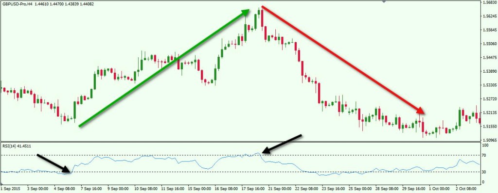
Above we have the H4 chart of GBP/USD for the period Sep 1 – Oct 2, 2015. At the bottom of the chart you will see the Relative Strength Index (RSI) technical indicator. The image simply shows two signals in a row for an oversold and an overbought market coming from the RSI. After the first signal, which was in oversold territory, the price starts a strong and a steady increase, which lasts for about two weeks. Then we get the overbought signal on this GBP/USD Forex pair. The RSI breaks the overbought area and the price starts a strong decrease, which lasts for two weeks more.
Lagging Indicators
From the name you can tell that these are the indicators which lag. This means that the signal comes after the event and it acts like a confirmation, rather than a forecast. In this manner, we should emphasize that the biggest advantage of lagging indicators is that they typically give you LESS false signals than the leading indicators. On the other hand, their disadvantage is that they put you in the trend later. Let’s now discuss some of these types of technical indicators:
ADX (Average Directional Index)
The Average Directional Index (ADX) is a technical indicator used for trend analysis. It shows how strong and reliable a trend is. Do not confuse this with trend direction. The ADX indicator does not show trend direction. It only provides hints as the strength of a trend. The ADX indicator is considered to be one of the best trend indicators. The reason for this is that it shows the trend force with higher accuracy and it is very easy to understand.
The ADX is just a curved line, which moves between 0 and 60 for example. Traders consider ADX values above 35-40 as signals for very strong trends. This is when we want to be in the market trading that strong move! And on the contrary, values above 20 and below 30 are considered as indications of a developing trend. When the ADX value is below 20, it is usually an indication of a non-trending market condition. This is important to remember as most of the fakeouts happen during these low ADX values. Thus it is typically recommended to stay out of the market if the ADX is lower than 20, unless you are trading some sort of rangebound strategy. The image below will show you how the ADX indicator works:
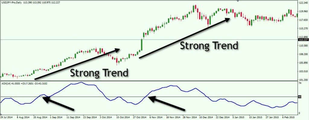
This is the Daily chart of USD/JPY for the period Jul 29, 2014 – Feb 17, 2015. Below you will see the ADX indicator with its 40.0 level line. As you see, a couple of times the ADX moves above 40.0. In that exact moment, the strength of the bullish trend increases. Since the ADX gives no information about the trend direction, it is up to us to decide where the trend is going. In this case, and usually in most cases, a quick glance at the chart, will make this crystal clear.
Bollinger Bands
Bollinger Bands are a technical indicator based on price volatility. It consists of an upper and a lower band, and a Simple Moving Average in the middle. The upper and the lower bands are used as support and resistance levels and the SMA is often used as a position trigger.
When the two bands are closer to each other, this means the currency pair is in a low volatility environment. When the bands start expanding, this means the Forex pair has experienced increased momentum and price volatility.
Take a look at the chart below:
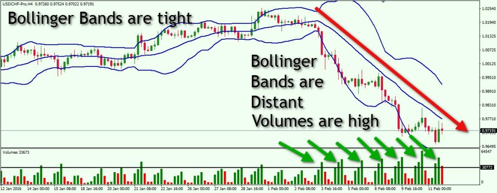
This is the USD/CHF on the H4 chart. The period is Jan 12 – Feb 11, 2016. We also put a Volume Indicator at the bottom of the chart, so you would be able to see why the Bollinger Bands lines expand. As you see, from January 12 until February 3, 2016 the Bollinger Bands lines have been pretty close to each other.
This means that the trading volumes by the USD/CHF are relatively low and the Swissy is rather ranging than trending. We placed a line on the Volume Indicator, which shows the average volumes of the Swissy until February 3.
On February 3, 2016 Bollinger Bands begin to expand, with unusually high Swissy volumes. At the same time, the price drops. This is when one should consider shorting the USD/CHF. The Volume Indicator confirms the trading expansion by the USD/CHF.
MACD (Moving Average Convergence Divergence)
The MACD is an indicator that takes two moving averages of two moving averages of the price, then it smoothes them by two other moving averages. In addition to the two moving averages of the indicator, there is also a histogram, which displays the difference (distance) between the two moving averages. As you probably guess, there is a relatively high amount of lag behind the MACD. Nevertheless, this is one of the most widely used Forex technical indicators.
The basic MACD signals are:
- Go long when the two MACD lines cross upwards.
- Go short when the two MACD lines cross downwards.
- Bearish Divergence – when MACD is moving downwards and the price upwards
- Bullish Divergence – when MACD is moving upwards and the price downwards
Now let me show you the MACD indicator in action:
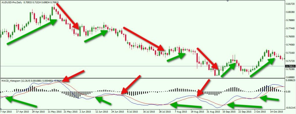
Above you see the daily chart of the AUD/USD. The period is Apr 7 – Oct 23, 2015. At the bottom of the chart you see the MACD with its histogram.
- The first green arrow on the MACD shows a bullish cross in the MACD lines – long signal. The price increases afterwards.
- The first red arrow on the MACD shows a bearish cross in the MACD lines – short signal. The price drops afterwards.
- Second green arrow – bullish MACD signal. The price does a slight increase, but then it drops turning a potential trade into a losing one.
- Second red arrow – bearish MACD signal. The Aussie does a big drop.
- Third green arrow – bullish MACD cross. AUD/USD increases slightly.
- Third red arrow – bearish MACD signal. The price decreases again.
- Fourth green arrow – bullish MACD cross. Price increases but then drops forcing the MACD lines to interact just for a flash. This trade is a loser.
- Fifth green arrow – bullish MACD cross. Price increases again.
Parabolic SAR (Stop and Reversal)
The Parabolic SAR indicator was created by Wells Wilder, who also created the RSI indicator. Visually it places little dots on the chart above and below the candles. When candles are closing upwards, the dots are below the candles. When candles start closing downwards, the dots switch above the candles. In comparison to some other indicators, Parabolic SAR is equally effective for entry and exit signals, but many traders use it mainly for its exit signal.
One Parabolic SAR rule that can be used is, buy when there are three dots below the candles and sell when there are three dots above the candles.
The image below will show you how exactly the Parabolic SAR works:
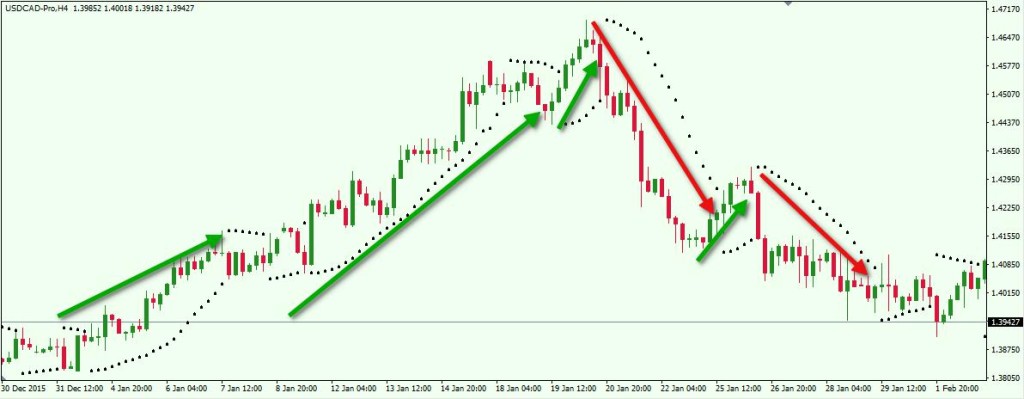
This is the H4 chart of the USD/CAD Forex pair. The period is Dec 30, 2015 – Feb 2, 2016. The black dots represent the Parabolic SAR indicator.
Conclusion
- Trading with indicators is one of the most popular ways to approach the Forex Market.
- Indicators should be used in context with current market conditions in order to minimize false signals.
- Technical analysis using indicators can be implemented in order to set more accurate entry and exit points on the charts.
- There are two types of indicators:
- Leading Indicators
- Lagging Indicators
- The most popular leading indicators are:
- Stochastic
- Relative Strength Index (RSI)
- The most popular lagging indicators are:
- Average Directional Index (ADX)
- Bollinger Bands
- Moving Average Convergence Divergence (MACD)
- Parabolic SAR (Stop and Reversal)